
Edge Effects, the excellent new blog produced by the University of Wisconsin-Madison’s Center for Culture, History, and Environment, recently published a short article I wrote on digital humanities and environmental history. My post, Look to the Land: Visualizing Changes in Agriculture, discusses the importance of data visualizations in the humanities, and the importance of understanding long-run trends in our agricultural food systems.

Stemming from a new book chapter I wrote on the agricultural history of Prince Edward Island, this blog post discusses the visual patterns we can explore and illustrate using new tools like the motion bubble chart from Google Charts. My recent research challenges some of the simplistic assumptions people often attribute to PEI and the Atlantic region. For instance, PEI and New Brunswick potatoes are a critical part of the region’s primary sector output, and they are often implicated in the environmental deterioration of local agro-ecosystems. But in PEI, at least, potatoes and other row crops were a small part of land use until the very late twentieth century. We often read these recent phenomena back onto the past, and we miss some of the more stable, and in some cases, more destructive land use practices. A more nuanced examination of the rural experience in PEI would include several periods of rise and decline in various agricultural practices, and an steady focus on mixed animal husbandry and the fodder production required to support it.
One of the most useful ways to illustrate these patterns are through maps and charts. The motion bubble chart, recently popularized through Hans Rosling’s GapMinder project and Ted Talks, allows us to visualize trends in data containing 3 or 4 variables and changing over time. Most people have used the chart to compare countries over time, but I wanted to examine much smaller units within Canadian regions such as the Census Subdivision or CSDs. This allows us to see groupings that represent regional patterns within provinces and larger regions. We are also able to scale-up the analysis for much larger areas, and along with some excellent grad students and colleagues I am currently using this method to explore Great Plains datasets at the University of Saskatchewan.

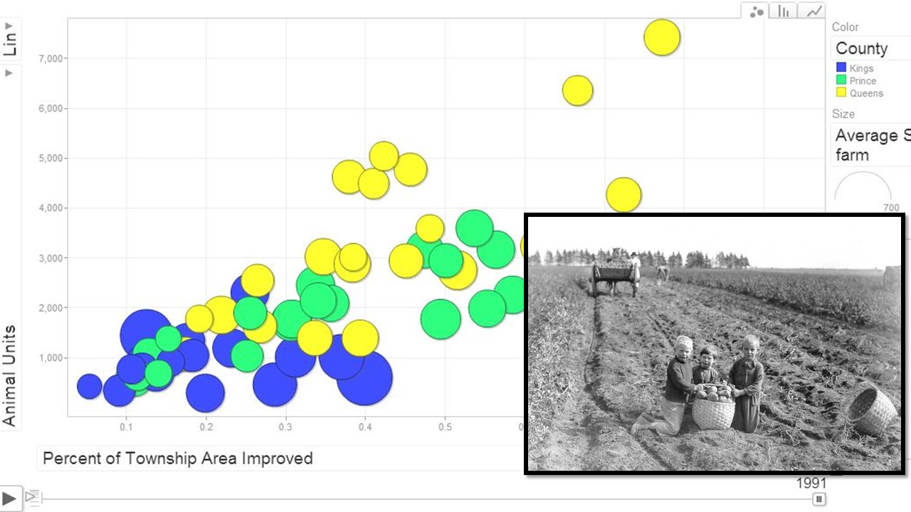
We recently completed data entry for Prince Edward Island’s CSDs (aka “Lots” or townships) with data from the Census of Agriculture. Using Google Charts I created a motion bubble chart that plots the proportion of each township’s land “improved” for agriculture against the number of “animal units” in each township. An animal unit is an equal standard developed by the Environmental Protection Agency that accounts for all livestock according to a calculation based on size and manure production. These two common indicators of agricultural intensity are represented on the two axes, and they change over time when the chart is activated. The third and fourth variables are the general location (County) of each township and the average size of farms in the township. These are represented by circle colour and size, respectively.
The end result is visible in this YouTube video.
You can also follow this link to an interactive version of the chart where you can see the original data, and use the tools to change the variables (focusing, for instance on cattle or sheep) and focus on certain locations (such as a single county, or a selection of townships). As I explain in the Edge Effects article:
As the bubbles move to the right they represent an intensification of land use in the early 20th century, followed by a period of outmigration and farm abandonment. Then, in the Post-WWII period, we see certain areas expanding both agricultural land use and livestock production, particularly in East Prince (green) and Queens Counties (yellow). Perhaps surprisingly, the farms in these areas remain relatively small, as represented by the size of the circles. The most aggressive process of farm consolidation and the abandonment of marginal land occurred in Kings county (blue), not the potato belt of East Prince.
As the chart demonstrates, the largest displacement of mixed animal husbandry on PEI agriculture occurred after 1961, and very unevenly across the province’s 67 townships. This is because the island followed a trend similar to other parts of eastern Canada, where modernization meant a sharp decline in the number of farms and consolidation among a number of larger landowners, and abandonment in many of the outlying regions.
The Atlantic region’s food landscape has not been adequately explored by environmental historians, and along with my work on mussel mud, land use, and biomass energy, this research represents a larger-scale examination of the dramatic changes in modern agriculture over the long run.