Teaching Historical GIS and Restoring Lost Communities in the Classroom

This article originally appeared on The Otter ~ La loutre, 1 November, 2016

Canadians have been hitting above their weight in the area of geospatial analysis since the development of the Canada Land Inventory and the world’s first Geographic Information System (GIS) in the 1960s and 1970s. Similarly, environmental historians and historical geographers have made great gains in Historical Geographic Information Systems (HGIS) research over the last decade, including several NiCHE projects, a 2014 edited collection, and now the Canadian HGIS Partnership. Canada is big. And in typical high modernist fashion, postwar scientists trying to fathom it ignored the knowledge of the rural, northern, and indigenous people who understood its land and water. Instead scientists turned to digital tools like GIS to examine and measure the nation. In what we believe is a post-normal and integrative approach, environmental historians are now both using the software and critiquing the normative processes it helped to create. But Canada is still big; its libraries, students, and other knowledge resources are very far afield. Our communities of digital scholars employ digital tools to collaborate and communicate our results across the continent. This post focuses on the students using these tools and the new ways historians are teaching HGIS online. This kicks off a series written by NiCHE and CHGIS collaborators on geospatial tools and analysis for Canadian historians.

I teach environmental humanities at Arizona State University, and although I am a Canadianist my Southwestern students are usually interested more in my knowledge of digital history, HGIS, and environmental history. I teach the many ways that digital tools allow us to explore the importance of place in the modern consciousness. At first I worried that I wouldn’t be able to shoehorn my Canadian research into my American courses, however, I discovered that place histories are surprisingly versatile in the classroom setting. They travel well in the digital medium. I also learned that many of my students are not Southwestern at all, mainly because of ASU’s growth in online teaching. In my first year I taught two courses to online MA students, one in Digital History and the other in GIS for Historians.

In the HGIS course, I decided to lead students through place history exercises, but I wanted to teach them using my familiar Canadian examples and then assign them group projects in the relatively uncharted territory of the Phoenix Metropolitan Area (PMA). So in the summer of 2016 twenty-six MA students learned basic GIS entirely online, they applied the skills they learned using data from Prince Edward Island, and they then worked in groups to recreate the historical geography of three “lost neighborhoods” in parts of the Southwest where many had never been.

J. H. Meacham, 1880 Illustrated Historical Atlas of Prince Edward Island. Courtesy of Island Imagined.

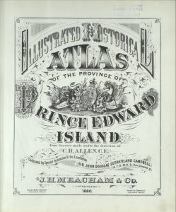
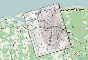
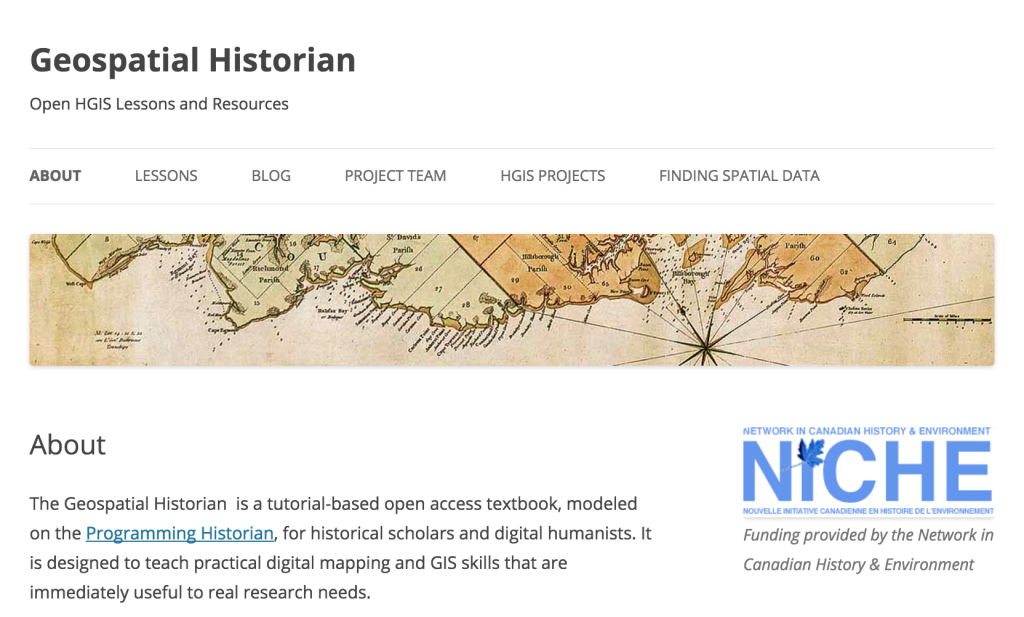
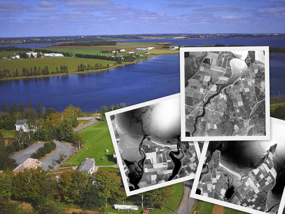
Learning HGIS online was possible in part because of The Geospatial Historian open access tutorial, which I explain below, and because of open source software like QGIS. Students were eager to try the software and apply it to the sample data from Prince Edward Island through the Geospatial Historian lessons. By working on new PEI case studies they were able to process historical maps from an 1880 atlas, “ground truth” their results in GIS, and then digitize the residences recorded on the maps. Students learned to georeference historical maps and determine whether the mapped features were appropriate for analysis at various scales. They worked individually, but the end result was a collective map of rural settlement patterns in the province.

Detail of a georeferenced historical map and the combined digitized house locations from the 1880 Historical Atlas of PEI. Each student digitized a different township, symbolized here by the different colours.

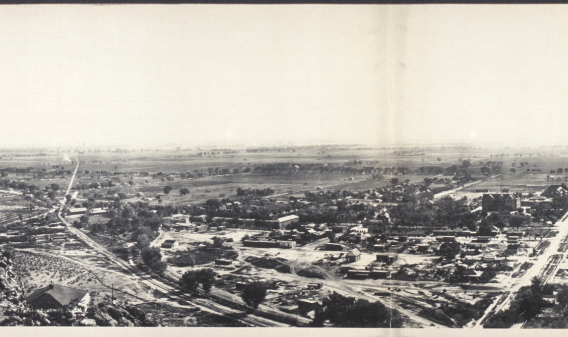
The students then turned to original work in the Phoenix area, and they eagerly tackled the tools and the projects because they recognized the importance of this work. The three neighborhoods we selected reflect some of the most critical social issues of our time: racism in residential schools, like the Phoenix Indian School, and poverty, migration, and segregation in Mexican American barrios in the Southwest borderlands. Two of these neighborhoods are virtual ghost towns in the middle of large Southwestern cities, yet in different ways they play host to their former residents.

The Phoenix Indian School was one of the largest and longest running residential schools in the United States. It was decommissioned by the federal government in 1990, but nearby Native communities are very active in its restoration, and recent efforts have led to historic preservation projects. One of the groups in

HST580 Group 1 site visit at Phoenix Indian School

my HGIS class made wonderful use of the technology and the digital records to recreate some of the important changes in and pressures on this now very valuable piece of Phoenix’s real estate. HGIS and the online forum facilitated their research and energized their work. And like the other teams, the Phoenix Indian School group asked local members to visit the site. These two students surveyed the site in the summer heat, and they interviewed local experts like Patty Talahongva, a former residential school student who is now working to build a memory and healing project in one of the school’s main buildings. (See the students’ Phoenix Indian School website here)

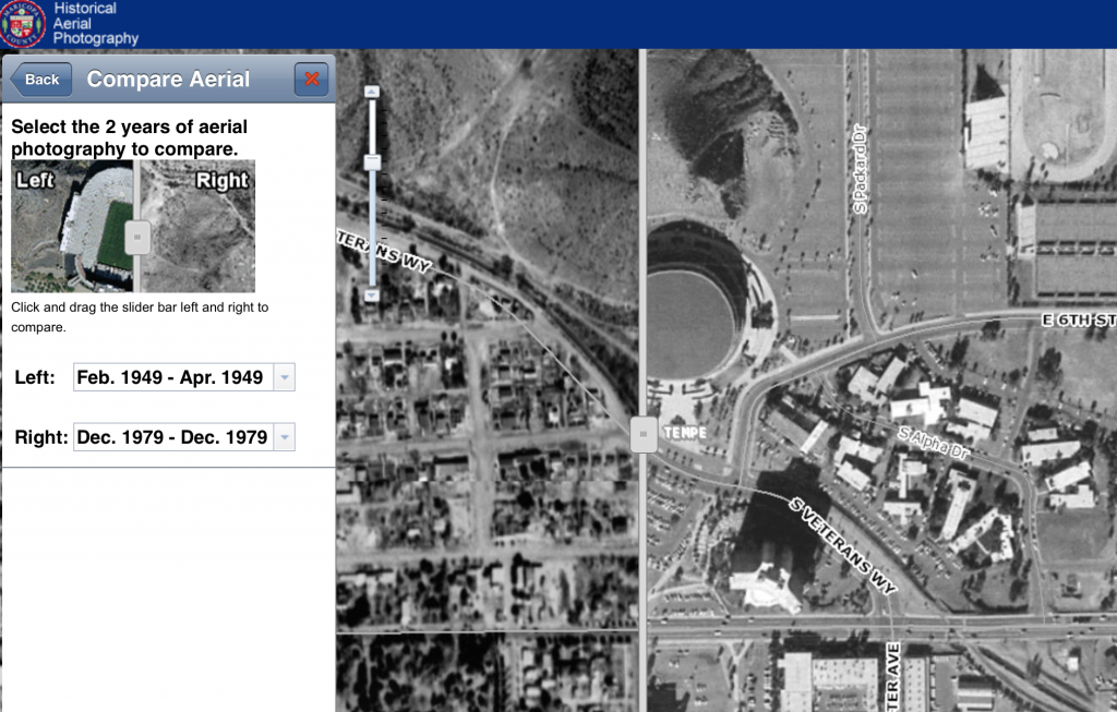
San Pablo was a Hispanic barrio completely erased from east Tempe, Arizona in the 1950s in order to make way for the expansion of ASU. Students in the San Pablo study group used several innovative methods, including Prezi videos and historical aerial photo interpretation to display the way this community lived in the early twentieth century. In some ways, San Pablo’s inhabitants return as part of the New American University’s initiatives to encourage enrollment from students of color and to make the student body representative of local demographics. (See the students’ San Pablo website here)

The third neighborhood, the postwar migrant barrio Victory Acres, is the only one of the three “lost neighborhoods” that still exists in the Phoenix Metropolitan Area. However, it was so radically reshaped by urban development in the 1970s and highway construction in the 1980s that in 1993 one local historian claimed that “Victory Acres shows just a few vestiges of the old barrio.”[1] Using a combination of local histories, historical aerial photographs, census data, and site visits, the students in this group reconstructed Victory Acres before and after the development of a major highway that isolated the neighborhood and removed many of its houses. (See the students’ Victory Acres website here)

Historical GIS is an optimal tool for researching and rebuilding lost neighborhoods, and it is possible to teach these skills in the classroom and even online. However, there were still many roadblocks ahead of us in this course. GIS training usually requires expensive software and many hours of technical training in a lab setting. Conducting historical geography projects often requires people with local connections to visit archives, find maps and other non-digital historical sources, and “ground truth” maps to explain problems in cartography, georeferencing, and historical data. We had limited technical support, no on-the-ground local supports, and only six weeks to run the course. Most of the students had little or no experience with GIS or historical geography. Furthermore, I was traveling and the course would be taught almost entirely away from my desk. It is remarkable that the students accomplished as much as they did.

Fortunately, Jim Clifford, Daniel Macfarlane and I had produced an online open access tutorial designed to introduce historians to simple GIS project development and analysis. The website is called The Geospatial Historian, and following the model of the Programming Historian it was designed to teach students to use open source software for doing digital history. In June I presented the Geospatial Historian website at the Canadian Historical GIS network mid-term meeting (see slides here), and I discussed my plans to use it for teaching at ASU.

Another key to the course’s success was securing historical data from both ASU Library’s GIS data and Maricopa County’s Historical Aerial Photograph Collection. By using historical aerial photographs in a GIS, students were able to recreate large sections of these neighborhoods and compare change over time.

maricopa-county-historical-aerial-photography-san-pablo-asu-campus-compared-1949-1979
San Pablo and ASU Campus compared 1949-1979. In the 1979 imagery to the right (East) the appearance of parking lots, dormitories, and a stadium have visibly replaced most of the San Pablo barrio. Source: Maricopa County historical aerial photography

Historical GIS is a practice within the larger field of digital humanities (or as Ted Underwood recently described it using digits to understand the humanities). Richard White considered GIS a key part of the “spatial turn” in the humanities, and he argues that HGIS researchers often uncover more than they give themselves credit for. My students made innovative use of this new methodology to uncover the systemic racism of modern urban developments, from highways to university campuses. However, they emphasized the human stories behind the data. They recognized that a historical GIS is essentially a system for storing information and making maps, two skillsets that were pretty well codified in the early enlightenment. For all of its hype, HGIS is in many ways a computerized, map-enabled filing cabinet.

One of the central features of an historical GIS is to store and access large amounts of spatially explicit data. Like all historians, our filing cabinets collect a lot of information that will simply not appear in any way in a published project. The same is true for a GIS. Painstaking work on street-level, year-by-year data series can often result in a layer that is never published, or at least a layer whose historical attributes are not labeled or discussed. However, it is a tool that allows the historian to not only store the information but to process it and analyze it in completely unique ways. The new avenues for teaching environmental history and historical geography through digital history and projects like the CHGIS offer great promise for students of Canadian and other lost or changing landscapes.

Acknowledgements

I would like to thank the students of HST 580: GIS for Historians for their excellent work on these communities. I would also like to acknowledge the help and advice offered by many colleagues and GIS professionals, including Nancy Dallett (ASU), Eric Feldman (Maricopa County), William Kyngesburye (KyngChaos), Tammy Parker (City of Phoenix), Matt Robinson (ASU), Jared Smith (Tempe History Museum), Patty Talahongva (Native American Connections), Mark Tebeau (ASU) Philip VanderMeer (ASU), Karina Wilhelm (ASU Map Library), Mary Whelan (ASU GIS Librarian).

[1] Scott W. Solliday, “the Journey to Rio Salado: Hispanic Migrations to Tempe, Arizona” (ASU MA Thesis, 1993), 123.

Teaching Historical GIS Online: The Geospatial Historian

As a Collaborator on the Canadian Historical GIS Partnership I had the opportunity to meet with many of the incredible Canadians who are using Geographic Information Systems to advance historical research and presentation in higher education. The mid-term meeting was held in Toronto, and it included scholars and practitioners from across the country (and the US, of course). A summary of the highlights from that event can be found here.

Niagara Falls Aerial Photos (1934) on Scholars GeoPortal

Anyone who uses tools like Scholars GeoPortal or Montréal, l’avenir du passé (MAP) to retrieve historical data will want to check out the presentations in more detail in the program here.The GeoPortal is becoming an especially impressive repository and visualization tool for historical geospatial materials. Our parters at ESRI Canada also demonstrated some of the new functionality of ArcGIS Online and Story Maps viewers for the kinds of portal the CHGIS Partnership plans to develop.  

My presentation focused on how I was planning to use ASU Online’s teaching platforms and the Geospatial Historian (the open source web tutorial I created with Jim Clifford and Dan Macfarlane) in an introductory summer course at ASU. Anyone interested in more information can check out my presentation slides here.

Acknowledgements: I am indebted to Dr. Penelope Adams Moon, Director of Online Graduate Programs at the School of Historical, Philosophical, and Religious Studies at Arizona State University for much of the material on ASU’s online programs. She has written an excellent piece about online teaching at Inside Higher Ed. Teach Online … Before It’s Too Late

Geospatial Historian screenshot

PEI’s Changing Landscapes: HGIS Research Featured on Nature’s Past

My chapter on Prince Edward Island’s changing landscapes and land use (Top-down History) was featured in the latest episode of the Nature’s Past podcast today. This was a roundtable interview with Jennifer Bonnell, Marcel Fortin, John Lutz, and me. We discussed the changing role of historical Geographic Information Systems (HGIS) in academic research, and the role of the new book edited by Bonnell and Fortin HGIS Research in Canada. I was able to speak to the advanced geospatial analyses I performed on Prince Edward Island’s environmental history, with the help of William Glen.

The episode is available at:
http://niche-canada.org/2015/01/26/natures-past-episode-46-historical-gis-research-in-canada/

HGIS-in-Canada-Cover-300x165Sean Kheraj created Nature’s Past as one of the many digital initiatives of the Network in Canadian History & Environment (NiCHE). As he explains in this episode: “To help researchers in the field of environmental history get acquainted with the uses of [HGIS] technology, the University of Calgary Press and the Network in Canadian History and Environment have published a new book called, Historical GIS Research in Canada. You can read our review of the the book here.” The podcast was a really lovely way to cap off this excellent project.

Sources:

Kheraj, Sean. “Episode 46: Historical GIS Research in Canada” Nature’s Past: Canadian Environmental History Podcast. 26 January 2015.

Joshua MacFadyen and William Glen, [pdf] “Top-down History: Delimiting Forests, Farms, and the Census of Agriculture on Prince Edward Island Using Aerial Photography, ca.1900-2000,” in Jennifer Bonnell and Marcel Fortin eds., Historical GIS Research in Canada (Calgary: University of Calgary Press, Canadian History & Environment Series, 2014), 197-223.

Swallowed by the Sea/shore

Once a jumping off point for swimmers, this lighthouse is now 600m from the channel at St Peters Harbour PEI due to coastal accretion. Historical photos courtesy of Carol Livingstone, PEI Lighthouse Society.

At the start of the summer NiCHE asked for our favourite and most meaningful photos from summer research or vacation. OK I’ll bite. I’ve seen some amazing landscapes and images so far this year, being lucky (or maybe foolish) enough to have travelled from Vancouver Island, BC to Twillingate Island, Newfoundland, and spent at least a few hours in seven other provinces. But the most meaningful photos to my research have been of the lighthouse at St. Peters Harbour, Prince Edward Island, the earliest in 1917, another in 1965 (both courtesy of Carol Livingstone), and the latest taken by me in July 2013.

I’ve never actually come across a lighthouse in my research, but something keeps bringing me back to the north shore of PEI, and to St. Peters Bay where this structure is testament to a changing coastline. My research is mostly about how Atlantic Canadian farmers procured fertilizers and fuels from wildlands, but I’ve also been interested in the use of aerial photographs for studying both land use and landscape change. Alan MacEachern and I discussed St Peters and other North Shore landscapes in Time Flies, a poster at the American Society for Environmental History in Toronto this year, and I recently wrote about mussel-mud digging farmers a little further up St. Peters Bay in Land and Sea. The aerial photographs show that the landscape has changed dramatically since 1935, but it wasn’t until I visited this particular lighthouse — ironically difficult to spot on a vertical air photo — that I realized how extensively this coastline was shaped by the sea.

Walking along the shore west of St. Peters Bay, it does not seem obvious that the early twentieth century beach was once over 150 metres landward. But the location of a square tapered lighthouse nestled deep in the sand dunes, and the ruins of a wharf in a shallow barachois pond beyond that provide some clues. Photographs and aerial photos from the last ninety-six years show that the lighthouse was once flanked by flat beaches and the St. Peters harbour fishing wharf (see 1917). Sand was constantly collecting on these shores, banking around the lighthouse by 1965 and filling in the channel to the Bay. The wharf site was abandoned in 1951, but the lighthouse remained an ever-fixed mark, a datum in the rising sand. When I was exploring the site a woman told me that her grandfather once fished from the wharf and her uncles used to jump from the top railing into the nearby channel. Now the wharf is mostly buried and the lighthouse is 600 metres from the channel leading into St. Peters Bay.

The accretion of sand around the mouth of the harbour has long been a problem for local residents. For most of the history of this landscape there was of course no lighthouse or wharf at all. When the Mi’Kmaw first appeared on this location the ocean was much lower and further away, and Prince Edward Island itself wasn’t even an island.[1] By 1719, Havre Saint-Pierre was resettled by Acadians, becoming the original and most important Acadian fishing village on what they called Isle Saint Jean. In 1752 French travel writer Thomas Pichon complained about the limited access for large ships and reported a “sand bar that forms at the mouth of the harbour.” The main approach to unwanted accretion is to build large berms in places that would collect the sand before it entered the harbour. These improvements were demanded by PEI officials in 1857 and carried out by Ottawa in the late nineteenth century. But still, engineers could not keep the sand from covering the wharf, entering the channel, and drifting over the lighthouse walls. Thus, St. Peters lighthouse is slowly going the way of Anakin Skywalker’s movie-set home (to which many say good riddance); Anne of Green Gables’ house in Cavendish, PEI, seems safe enough for now.

Lighthouses were critical infrastructure in the nineteenth century. To many travellers they were more familiar and important than traffic lights are to us today, but now that we mostly travel by land, and navigate by GPS, lighthouses are at risk of disappearing. The risk is not just financial but also environmental. Most PEI lighthouses only make the news when their sandy perch is threatened by coastal erosion. As Federal funding disappears and climate change exacerbates coastal change, the outlook for lighthouses is darker than a night of heavy fog. But some lighthouses actually find themselves further from the ocean every year, and in St. Peters Harbour the lighthouse is a beacon for another kind of landscape change.

The more we learn about climate change, fragile coastlines, and our own unpreparedness for flooding (for example in Calgary and Toronto), the more we know we shouldn’t be building our houses on the sand. Coastal erosion has caused a major disturbance to estuarine habitats and human infrastructure in Atlantic Canada since the early twentieth century. Many parts of PEI’s north shore are eroding at rates of over 1 metre per year, and sea level rise and the increased frequency and intensity of storms in the twenty-first century suggest it will get worse. The human response to this information has not been promising. The proliferation of residential, recreational and other infrastructure in the St. Peters Harbour area suggests that people will build as close to sensitive coastal areas as possible.

St Peters Harbour Map - Showing development and lighthouse, 2010.
St Peters Harbour Map – Showing development and lighthouse, 2010.

People will also build over heritage areas, perhaps even unwittingly, without a better understanding of human ecology and these historical landscapes. Tracing these shifting landscapes is no simple task. The Greenwich section of the Prince Edward Island National Park is located across the mouth of the St. Peters Harbour, and although it presents an excellent historical and archaeological survey of the inhabitants of St. Peters Bay, it does not identify the location of important nearby sites like the 18th century village of Havre Saint-Pierre, the 19th century harbour improvements, or the twentieth century Provincial mussel mud dredge. Environmental history, including methods such as the interpretation of aerial photographs and historical maps, can help identify these sites and their significance to local ecosystems.

Environmental history is required for more than a commemoration of lighthouses and Mi’Kmaw, Acadian, and Canadian homes and fisheries, but also for an understanding of human ecosystems over time. As Matthew Hatvany has argued, coastal change is highly complex and requires an awareness of both long run history and the ways we think about science.


View Lighthouses of Prince Edward Island in a larger map

Postscript: I discovered that the title I was planning to use for this piece, “sea change,” was scooped by Lapham’s Quarterly on the same day (The LQ podcast Out at Sea features some exquisite readings by Lewis Lapham). “Washed up” or “Beached” lighthouse didn’t have the same ring to them, so I went with Swallowed by the Seashore.


[1] Kate MacQuarrie, “A River Ran Through it,” Island Magazine 49 (Spring-Summer 2001): 16-25.

Remote Sensing and Historical GIS

(Originally posted on The Otter, Jan 10, 2013)

Forty years ago, on Christmas Eve 1972, NASA released a gift to the public, the “Blue Marble” image of the whole Earth from space. This photograph was unplanned and originally unwanted by NASA, but it quickly became one of the most reproduced images on Earth.[1]

The Blue Marble: View of the earth as seen by the Apollo 17 crew traveling toward the moon. Source, Wikipedia

The astronauts aboard Apollo 17 were the first humans to find themselves in that sweet spot between the earth and the sun that offers a full view of the planet. It was an unprecedented photo op at 28,000 miles, and it has never occurred since. Other photos and compilations were made of Earth from space, but there is something about the clarity, colour, and serendipity of this photograph that sets it apart. It became the iconic image of the environmentalist movement and the epitome of remote sensing in the twentieth century.

In part three of our series on practical Geographic Information Systems (GIS) guides for historians we look at air photos and remote sensing. Remote sensing is the observation of any phenomenon from a distance, or a study made without handling the subject. In a way, all historians practice it. In geospatial terms, remote sensing is the analysis of geographic data captured from the air or space.

We have always been capable of imagining the landscape from above. One of the earliest maps is an oblique aerial view of the Paleolithic town Catalhoyuk, and bird’s eye views of cities became popular in early modern Europe. Of course these were stylized maps and not actually based on remote sensing. But there is a universal desire to see the world from above, or at least to understand the things we can’t reach. Some of the first Canadian maps created from remote sensing data were navigational charts of coasts and river bottoms. In the late nineteenth century, photogrammetry was used for mapping, especially in mountain terrain. Almost as soon as humans took to the air and to space, aerial and satellite photography blanketed the globe and transformed twentieth century cartography.

In this post we deal mostly with aerial photographs, although recent work has also been done on using satellite imagery in historical research.

What can historians do with historical air photos?

In Nature’s Economy, Donald Worster wrote about the historical impact of seeing the planet’s “thin film of life” in the Blue Marble photograph.[2] The earth we touch, taste, and consume seems universal and unlimited, but sensing the planet from above reveals limits and interdependent systems. From 28,000 miles we are fragile, unique, and alone.

Most historians will be interested in historical images taken a little closer to Earth; there are many and they have many uses. Good historical land use data matters, and remote sensing is one of the historian’s and historical geographer’s primary documents for understanding environmental change.

Air photos are also commonly used as supplements to other historical research. For instance, a 1958 air photo of a small island in Prince Edward Island National Park, shows that the island had quite recently been connected to the mainland by a causeway. A later image of the same landscape showed that the island eroded more quickly as a result. By comparing the three images (before, during, and after 1958) in a GIS, historians can measure the precise rate of erosion before and after the construction of the causeway. Thus, air photos contain information about place, single events that occurred in that place, and more gradual trends such as coastline change. All of this is possible with three photos.

some_text
Aerial photo of Robinsons Island, PEI 1935

some_text
Aerial photo of Robinsons Island, PEI 1958

some_text
Aerial photo of Robinsons Island (west end), 1974

What do you need to get started?

First you’ll need some air photos of your area of interest. There are two main forms of aerial photographs, vertical and oblique. Vertical photos are taken at a 90-degree angle and oblique at something closer to 45 degrees. Both forms were used for surveying and mapping. Vertical photos offered a less distorted image of the terrain, and these became standard practice in the inter-war period.

The good news is that Canada was a leader in aerial photography, so its collections date back to the 1920s and it has a lot of them – a lot, as in over 6 million. That’s also the bad news. Locating the air photos for the right time and the right place for your research can be daunting. Most of these documents can be found at the National Air Photo Library (NAPL), but localized collections also exist in government offices, university libraries, and some museums.

Managing the collection will also take some planning; the earliest air photos were taken at a scale of about 1:15,000 (one 9 inch photo represents over 2 miles of terrain) and overlapped, so a single Prairie township occupied up to 50 photos. A GIS is an excellent tool for displaying, managing, and eventually analyzing the images. If you plan to incorporate air photos into a GIS, be aware that large numbers of high resolution images will take up a lot of processing power.

Fortunately, most air photo collections are labeled and well organized, and in some cases they are searchable using a map index. The Canadian National Air Photo Library’s catalogue is available at NAPL Online. This search engine is a bit tricky to get used to (see search tips), but once you’ve identified your research area on the map, it allows you to display the approximate location and outlines for each air photo. Many of NAPL’s images have already been digitized, and the engine will show low-resolution previews of any digitized photo. From there you will have to record the call numbers and request copies from the library, at a cost.

Other providers offer historical imagery for free, such as the Government of Prince Edward Island, although getting the highest resolution may still require ordering originals from NAPL. See the working list of aerial photo collections in Canadian university, provincial, and municipal archives, at the end of this post.

What programs do you need to view air photos?

This depends on what file format the digitized photos came in and what you want to do with them. There are three main types of digitized air photos, and GIS users group them under “raster” based data.

The first and most common is a 2-dimensional raster image (for example .jpg) without geographic coordinates. These images are no different than a photo of your friends on Facebook. They can be opened in any browser or image preview software, and they are easy to explore. However, since they lack geographic coordinates, you could not incorporate them into a GIS and have them line up with other features. In order to do this you must either “georeference” or “orthorectify” the image which converts it into the second and third raster type.

Georeferenced air photos are the same as the 2-dimensional images, except they have been given geographic coordinates and made to fit the 3-dimensional curve of the earth. They are then saved as a new file format (for example TIFF and GeoTIFF are non-proprietary formats that will open in a variety of GIS programs). We will explain how to assign control points and georeference images in another guide, because it applies to any historical map or image that you might want to incorporate into your GIS. However, unlike maps, air photos are images captured with a lens, and like all photographs they contain distortions. Distances and shapes become distorted as features move away from the centre of the image toward the edges. If geographic precision and accurate measurements are important to your research then you need to consider the third format, orthoimages.

Orthorectified images, often just called “orthos,” are 2-dimensional images that have been given both geographic coordinates and geometric correction to account for the curvature of the earth and distortion in the images. Most GIS software will orthorectify air photos, but it requires more than just control points. Information on the altitude, lens type, and angle of the camera are required for each photo. This was usually recorded in flight logs, but in very early air photos it might not be possible to ascertain. Again, if your main interest is in observing features in the landscape or general land use over time, orthorectification is not required.

Georeferenced and orthorectified images are most commonly saved in GeoTiff (.tif) format, and these are easily opened by GIS programs such as Quantum GIS, ArcGIS, and MapInfo. Other formats include MrSID, an early raster format popular among GIS users, and more recently KMZ (a zipped Keyhole Markup Language format). Images stored as KMZ open in Google Earth and allow quick and easy overlays and measurement.

Go ahead, try it!

The University of Waterloo Map Library has an excellent collection of aerial photos from the Waterloo Region and beyond. To explore their collection of digitized air photos you can navigate through the Air Photos Digitization Project. Once you’ve found an area you would like to open in a GIS or Google Earth you can choose a file format and download it. For example, try downloadingthe KMZ in this section of rural Woolwich township (as they instruct, remove .zip from the filename after downloading) and open it in Google Earth. You will be able to zoom in and out, tilt for a 3D effect, and add layers from Google’s collection.

The Waterloo example is one of the best in Canada at the moment, but as you will see from the list below, almost every Canadian centre has an air photo collection. Go ahead and explore, and if you find some images of the world you know from above, you might want to contact the library and the other guides in this series for help.

Josh MacFadyen is a Postdoctoral Fellow at the University of Western Ontario and the Project Coordinator for NiCHE.


[1] Donald J. Wuebbles, “Celebrating the ‘Blue Marble,’” Eos 93(49) (4 December 2012); 509-510; Robert Poole, Earthrise: How Man First Saw the Earth (New Haven: Yale University Press, 2008); Al Reinert, “The Blue Marble shot: Our first complete photograph of Earth,” Atlantic, 12 April, 2011. [Available at http://www.theatlantic.com/technology/archive/2011/04/the-blue-marble-shot-our-first-complete-photograph-of-earth/237167/]

[2] Donald Worster, Nature’s Economy: A History of Ecological Ideas (Cambridge: Cambridge University Press, 1977), 358-9.

Federal air photo and remote sensing holdings

University air photo holdings

NB: Since writing this post, it also came to my attention that York has an extensive collection of low-level oblique aerial photographs of conservation areas in Ontario taken by Lou Wise.

Other library and archival collections

Provincial holdings

Municipal holdings

  • City of Toronto Archives
  • The University of Waterloo Library has compiled a list of all the Canadian municipal governments that provide open GIS data online. The municipalities offering air photos include Fredericton, Nanaimo, North Okanagan, North Vancouver, Surrey, and Vancouver.

Many other municipalities provide limited historical air photos for viewing only, such as London,Red Deer, the Region of Waterloo, and many more in this list identified by the University of Waterloo Map Library.

Global datasets of interest

Scotland!

Aerial Photographs, Forest History, and P.E.I.’s First Energy Crisis

(First published on The Otter, May 12, 2012)

Recent studies of aerial photographs suggest that Prince Edward Island’s first energy crisis was not the 1973 oil embargo but a firewood shortage that predated OPEC by a century. Two posts on The Otter discuss some of the ways air photos can be used to understand landscape change in the PEI National Park, and a new exhibit stresses the importance of seeing these images as snapshots of time as well as place. Air photos can also be used in a Geographic Information System (GIS) to study land cover and land use change, and the resulting data offer a new tool for understanding the difficult balance between clearing forests for agriculture and leaving enough for fencing, forage, and fuel.

Tourists who approach Prince Edward Island on the ferry in 2012 disembark at “Wood Islands” and take in a coastal landscape of relatively unbroken forest, but the ferry’s first passage in the late 1930s would have revealed a very different and almost completely denuded coastline. (Early tourist invitations to “come play on our island” might have included a suggestion to “bring your own firewood.”) The 20th century forest regeneration at Wood Islands echoes a well known story of outmigration and agricultural downsizing in the Atlantic region, evident in sources like the Census of Agriculture. Historians assume that farm abandonment occurred primarily on marginal lands, as families adapted to poor soils and a poorer economy, but air photos offer a detailed portrait and a spatially explicit model of different stresses such as declining access to woodlots and other wildland resources.

At the beginning of the 20th century Prince Edward Island’s forests had reached a nadir from extensive agricultural and commercial exploitation of the forest. But only a generation or two earlier, there was an abundance of forest. In 1861, the average Island farmer lived on properties which were only about 38 percent “arable,” or cleared to the extent they could be cropped. Taking into consideration the other thirty percent of the colony not in farms, we see that only about a quarter of the Island had actually been deforested. Forest historians argue that by the end of the century over 70 percent of the Province was cleared for agriculture and the forest that remained had been harvested several times for the shipbuilding industry and domestic use.

In a recent Otter post I described how Prince Edward Island farmers responded to a critical food shortage, when the Province’s ruminant population outpaced its marsh and upland hay production. Farmers took to the ice and spent a large part of the winter dredging “mussel mud” to enrich their fields and expand the production of hay and cereals. However, this practice was prevalent in areas where farmers had already cleared most of their land, both because growth required either new land or more productive land and because farms in these areas were running out of firewood. With little forest left, many of these farmers turned their winter activities to hauling mussel mud and began to buy coal or commercial firewood for domestic energy.

Using air photos it is possible to identify places where this likely occurred. Figure 1 shows a composite image of four map overlays (labelled A-D on the right) and the location of every home in Lot 30 (labelled on the left), a rural township to the west of Charlottetown. These layers allow me to identify the precise location of homes, the location of the forest, and the places where the density of homes and scarcity of forest would have caused a biomass energy crisis. These data are all derived from PEI’s aerial photographs which were first flown for many Canadian jurisdictions in the 1920s and 1930s. The original air photos were subsequently used to create maps for the National Topographic Series, and in 1990 the Province of PEI also used them to create historical forest and land use inventories. In the final layer, I used a GIS to measure the amount of forest located within a 2.5 Km radius of each home and made an “energy crisis map” based on the density of points in selected PEI study sites.

pei-macfadyenmap1935
Figure 1: Forest history data derived from air photos, Bonshaw, Lot 30, P.E.I. 1935. Photos and inventory courtesy of PEI Dept of Forestry.

This map shows areas where rural and small town resettlement was putting pressure on natural ecosystems. For example, Lot 30 had approximately 14 hectares of forest for every home, but the homes marked with blue dots had direct access to less than 5. Clearly these farmers lived in an interconnected world and had access to fuel from local outfits and importers, but what is important here is that their immediate fuel supplies would not have lasted more than a few years at even a conservative rate of consumption.

Additional research and a presentation at the Canadian Historical Association / Canadian Association of Geographers at Congress 2012, in Waterloo, will show what kinds of woodlots remained in the most densely inhabited areas. We might expect that harvesting was most intense in those areas and regenerating plots were not. The forest inventories recorded not only the outline but the cover type of each forest parcel, and GIS lets us query the inventories for these sorts of questions.

The 1935 PEI inventory may be the earliest in Canada, and due to the Province’s small size and complete air photo coverage it is certainly the most comprehensive. Behind the inventories, however, are ordinary air photos, and researchers interested in recreating topographic features can find great coverage of local areas at university libraries such as Brock, Dalhousie, Toronto, Waterloo, and Western. For larger areas consult the National Air Photo Library’s enormous collection and online search engine in Ottawa. All air photos contain distortions, and if your research relies on accurate locations, distances, and measurements it is important to correctly “georectify” and digitize these features with the proper projection in a GIS. Many <href=”#/Fundamentals_for_georeferencing_a_raster_dataset/009t000000mn000000/”>online tutorials are available to help with these processes. If you only require the general description and location of topographic features then you might want to use the closest National Topographic Series (NTS) map for your period of interest.

Aerial photographs, NTS maps, and historical forest and land use inventories offer a new way to study the relationship between farms and forests. If the NTS maps were a sort of census of the Canadian environment in certain years, then aerial photos were the original manuscripts behind the printed census. Just as social and economic historians often need to consult the nominal censuses for a new level of detail, historians of the environment can find information in the original air photos (e.g. forest types, land use, coastal erosion, building location/orientation, sub-urban spaces, pollution and brownfields, etc.) that may not have interested the cartographers.

Further reading:

  • D. G. Sobey and W. M. Glen, “A Mapping of the Present and Past Forest-types of Prince Edward Island,” Canadian Field-Naturalist 118 (4) (2004): 504-520.
  • There are several chapters of interest to NiCHE readers in Historical Geographic Information Systems in Canada a forthcoming book edited by Jennifer Bonnell and Marcel Fortin. The chapter by Joanna Dean and Jon Pasher uses air photos and other sources to measure urban forests, and Joshua MacFadyen and William Glen have presented a longer discussion of the PEI forest inventories in “Top-down history: Delimiting forests, farms, and the Agricultural Census on Prince Edward Island using Aerial Photography, c.1900-2000.”
  • Don Valley Historical Mapping Project
  • GeoWATCH: Geospatial Workshops in Atlantic Canadian History
  • NiCHE Resources for learning and developing Historical Geographic Information System (HGIS) projects.
  • National Air Photo Library